Print Testing and Breaking Out of Your Normal Box
by Victoria Schmitt
A couple of weeks ago LIGHT hosted a printing class featuring Hal Schmitt which I was able to assist. One of my favorite things as an assistant is being able to help people with their images. With small tricks of the trade in Photoshop or just being able to help someone to think outside of their normal processing workflow will sometimes give people that “ah-ha!” moment to go forward with at home.
Here is how I helped our students once they thought their image was “print ready”.
1. Do one more dust spot check. I like to blow the image up to 100%. Choose the spot healing brush tool (yes, there are 20 ways to everything in Photoshop and this is just one of them) and with the hand tool (hold down the space bar) jiggle the image a little bit as you pan across the image on your screen. Some people like to use page and page down- which is fine, just make sure that you are still “jiggling” the image. It helps those inconsistencies jump out to your eye.
2. Pan out to view the entire image on your screen. Does anything jump out to your eye in a negative way? Is there a light or dark area that fights the direction of your eye when you look at the image? Sometimes I find that I need to print out a test print to really see what the image is doing to the “viewer’s eye”. I’ll sometimes look at the center of the image or the area where you want your focus brought to. If your peripheral vision in the image catches a shape, tonal change or area that pulls your focus away from where you want it then work on that to “remove the shape” (usually a stick or object that could other wise just not exist), tone down your bright areas or crop out parts closer to the edge that keep the image from appearing complete.
3. Start with a small test print (8.5x11). This shows blatant areas that need attention, global tonal needs, and it also tests you to make sure your print settings are correct.
4. Print the next size up: I go with 13x19 paper size. This usually starts to show you more missed spots, more chromatic aberration color shifts and gives you a better idea of where they eye wants to move.
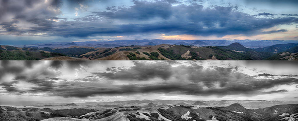
Something else you should consider about images that might just not feel right to you is trying the image in black and white. I had a student whose style screamed black and white and she had no idea until we tried it out. Her color versions didn’t have much of a pop or wow factor because my eye was trying to process the texture, movement, shape and color. Sometimes the best thing for your images is to simplify. Maybe you took that photo because you liked the texture, the lines, the movement and the subject…but you start processing color as well and your brain can get confused and wants to move on. Working on those images can make you frustrated!
This is when I will sometimes give myself shooting or processing assignments to release my brain from the usual workflow and give it something new to concentrate on. Go back to the images you have already shot and decided not to process. Ask yourself “why didn’t I process that image?” and go to town with it! Change the hues, crop it down, try it in vertical and horizontal! Go to Lightroom and make a few virtual copies, create 5-6 different versions and see if there is anything about that image that you like. If those 5-6 new versions don’t do it for you- delete it and save your hard drive space!
There is no right or wrong answer when it comes to YOUR work. Experiment to see what you like and see what works and what doesn’t. The next time you go out to shoot, keep those lessons in mind so you know what you’re going to work on later. You will become a more efficient photographer when it matters and more fun when you process.