Guest Blog! 5 Food Photography Tips

by Kent Cameron

Food photography has never been more popular. The interest in food and sharing food experiences have been driven by digital cameras, food blogging, Facebook, Pinterest, e-books, cookbook self-publishing and media like Food Network, which have all helped to fuel the food trend.

Following that trend, several years ago my wife, Sally, a professional chef, decided to create a food blog called, A Food Centric Life. She asked if I could use my photography skills to take some shots of her food. I quickly learned that creating great looking food images has its own special set of challenges.

Whether you are a photographer wanting to add food to your portfolio, a cookbook author, a blogger, or anyone interested in shooting food, here are a few tips from my food photography journey that may be helpful in your journey…

Tell a Story

When we prepare for a food shoot, we talk about the story first. The story may be about enjoying some crème brulee and espresso at a bistro in Paris, or grilling burgers in the park for a picnic on a rustic table, or something very simple.​

Ask yourself what the food or recipe means to you? Does it have meaning in your life? What is the setting? Is it a holiday, a seasonal dish, a fami­­­­ly favorite? What props, colors and textures are involved? How will you tell that story to the viewer with your image?

Direct the Light

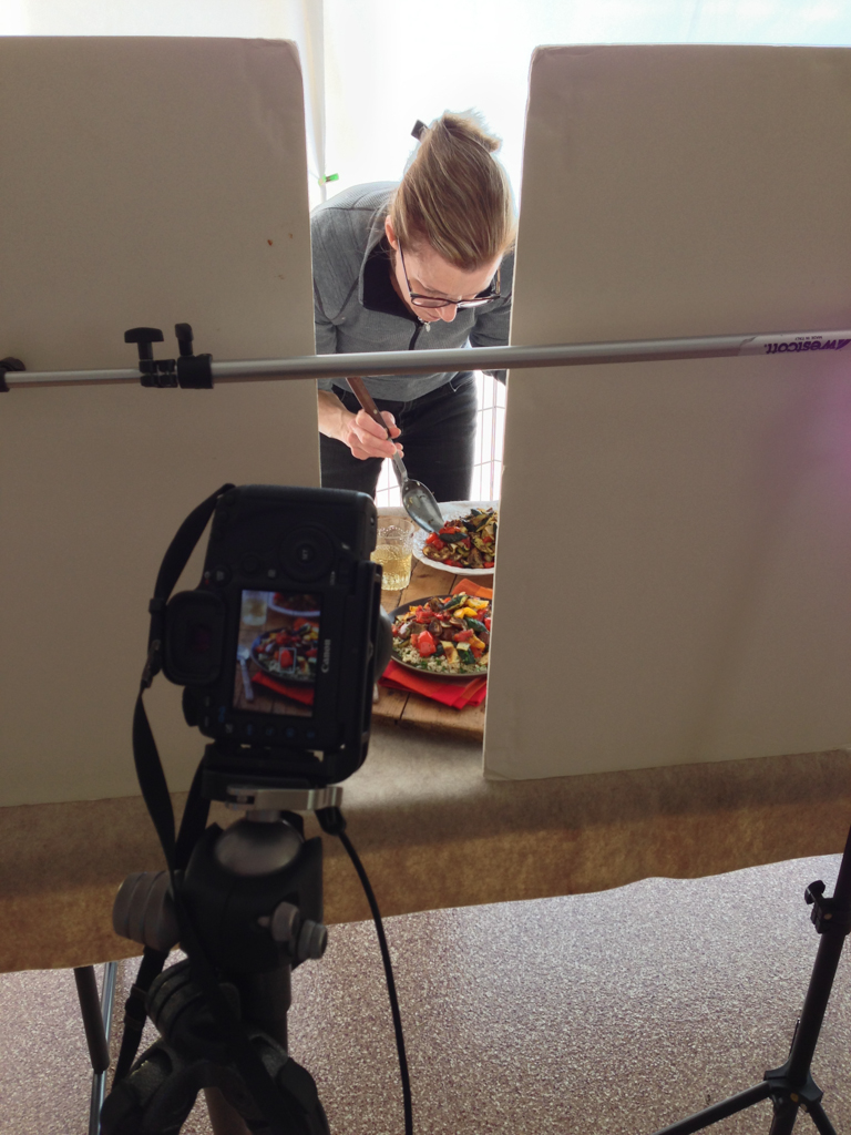
Look for light that has direction. It can be light through a window, or doorway. We often shoot food in our garage with the open garage door creating a large space with directional light. Or, we create directional light using studio lights when natural light is not available.

Set up the shot so that the light is coming from behind or from the side. Think about light direction like the hands on a clock. If the food is at 6:00, backlight is 12:00, and side light is 9:00 or 3:00. Lighting this way creates depth and interest in the food. Never light food directly from the front, and absolutely do not shoot food with a flash mounted on your camera.

Diffuse and Reflect

A common mistake is to over light food images. Once you have created a scene with directional light, then can decide how much highlight and shadow works for the shot. Use a diffuser to soften the light and control highlights. Not all food images use soft light, but it works great for many.

Use a reflector to control the amount of shadow. We use pieces of basic foam core board that you can buy at any art supply stores as a reflector. Position the foam core opposite the light. Use white foam core to reflect light and brighten the shadows, and black foam core to take light away, creating deeper shadows. It's amazing what you can do with your food images by just experimenting with reflectors.

Work the Composition

Amazingly subtle changes in your composition can make or break your image, so really work your shot angles, direction of the light, placement of the food and props in the shot. Use the composition rule of thirds and avoid placing food dead center in the frame.
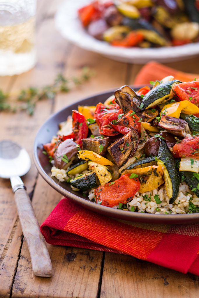
Style the Food

The job of a food stylist is to make the food look its best for the camera and create direction or flow of movement for the eye. Unless you are working a well budgeted food shoot, likely the food stylist is you! I am fortunate that my wife, Sally, is a chef so preparing and styling the food is her department. 

Buy top quality food and ingredients. You want beautiful food for beautiful food photos. When styling, think how you can create movement in the image. Add a flowing napkin with complementary color, for example, or maybe a utensil. Think about how you can add textures and create lines that draw the viewer's eye into the food scene.

Learn More about Food Photography

Kent and Sally Cameron work as a team, blending their love for great food, photography, and teaching to produce beautiful images that inspire and educate people about food.

Orange Ginger Creme Brulee.jpg
Turkey Burgers.jpg
Roasted Ratatouille.jpg

Rick Sammon: Color Efex Pro Tip

I photographed the “Official Parking Man” of Old Havana, Cuba. I like the straight shot, but I wanted to remove some of the reality from the scene, which is another advantage to using plug-ins. When we remove some of the reality from an image, our pictures can look more artistic and creative.

In Nik Software's Color Efex Pro
Filter: Bleach Bypass

Effect: Intensifies an image by creating a greater difference between highlights and shadows. Adds bold tones to an image.

Filter Tip: Experiment with Saturation settings. As with many effects, less is often best, as I found with this image. This effect works well with images that have fine lines.

Photo Tip: Keep in mind that people don’t always need to be looking directly into the camera when you take their portrait.

​And check out Rick's new iPhone/iPad app with 50+ tips on using Nik's Color Efex Pro.

Before

Before

After

After

Guest Blog! Flower Photos Beyond the Macro Lens

by Rob Sheppard

For Southern California where I live, spring is here and flowers are blooming. California as a whole has a very long spring compared to Minnesota where I grew up. Flowers can be found year round in many areas, plus a true spring in terms of flowers starts at the end of January and doesn’t end until June.

Flowers are such a great subject, too, because they are beautiful and they never run away from you or complain about having their picture taken! We are going to have a great field workshop to explore flower photography this April at LIGHT, and it will also include very practical work in Lightroom and critiques.

One of the first things many photographers think is that they must have a macro lens to do flower photography. While a macro lens can do many good things, it can also be very limiting for flowers because it is just one focal length.

I use focal lengths from 10mm fisheye to 400mm telephoto for flowers (I shoot APS-C format; for 35mm-full-frame, equivalent focal lengths would be 15mm fisheye to 600mm telephoto; for Four Thirds, this would be 8mm fisheye to 300mm telephoto). With the two California poppy photos seen here, I used a 10mm fisheye and a 200mm telephoto. With the yellow black-eye susan flowers, I used a 16mm wide-angle, and for the white thistle, a 400mm telephoto. I focus close in three ways: I look for lenses that focus close on their own, I use extension tubes, and I use achromatic close-up lenses.

Extension tubes are just that, empty tubes that extend the lens away from the camera body (you do want the kind that connect the camera electronics to the lens electronics, though). That allows any lens to focus closer. How close you can focus depends on the focal length to extension tube size. Wide-angle lenses need minimal extension to focus very close (usually you will find it difficult to use extension tubes for lenses wider than 24mm), while telephoto lenses need more. You can get a set of Kenko auto extension tubes for almost any camera brand, and I find they work well.

Achromatic close-up lenses are highly corrected close-up lenses that screw onto the front of your lens. Canon’s achromatic close-up lenses are best known – the 500D and 250D. I have a 77mm 500D that is big enough to be used with a wide-angle lens, plus I can use adapter rings to fit it to smaller diameter lenses.

Either extension tubes or achromatic close-up lenses can make all of your lenses act like macro lenses in terms of close-focusing. Results can be quite remarkable, though the quality can only be as good as the original lens. One thing you may find is that some lenses do well up close, and others do less well, and you cannot predict this by the price of the lens.

I love to use telephotos to isolate a flower and make it stand out against a soft, beautiful background. To do that, I will often shoot wide-open for f-stop – don’t be afraid of your wide f-stops such as f/2.8, f/4. f/5.6. Telephotos also compress distance and make a group of flowers tighter and more dense. They can also enlarge a portion of the background to make it work better behind your subject.

I love wide-angles for close-ups because now I can emphasize the environment of the flower. You now get in really close to the subject, and I mean REALLY close. Often I suggest photographers set their wide-angle to its closest focusing distance, with or without an achromatic close-up lens, and then move in until the flowers are in focus to really see the possibilities here. This forces you to get close.

A wide-angle up close makes the background smaller, yet more noticeable. It can be challenging to use because of that, but on the other hand, that is exactly what makes this type of shooting interesting. Depth of field is always greater so even out-of-focus areas are recognizable. Finally, perspective is stretched out so that flowers look like they are spread apart more. That can offer some very interesting opportunities for compositions that stretch back into the distance.

Come see Rob this spring and learn these techniques and more at his Springtime Flowers and Lightroom workshop April 24-28, 2013.​

Rob's free e-book, A Nature Photography Manifesto, is now available for the iPad or as a PDF e-book for any other computer. You can find the iPad interactive version at the iBooks Store. There are also links to both versions at www.robsheppardphoto.com/books.html.

Break OUT!

Print Testing and Breaking Out of Your Normal Box
by Victoria Schmitt

A couple of weeks ago LIGHT hosted a printing class featuring Hal Schmitt which I was able to assist. One of my favorite things as an assistant is being able to help people with their images. With small tricks of the trade in Photoshop or just being able to help someone to think outside of their normal processing workflow will sometimes give people that “ah-ha!” moment to go forward with at home.

Here is how I helped our students once they thought their image was “print ready”.

1. Do one more dust spot check. I like to blow the image up to 100%. Choose the spot healing brush tool (yes, there are 20 ways to everything in Photoshop and this is just one of them) and with the hand tool (hold down the space bar) jiggle the image a little bit as you pan across the image on your screen. Some people like to use page and page down- which is fine, just make sure that you are still “jiggling” the image. It helps those inconsistencies jump out to your eye.

2. Pan out to view the entire image on your screen. Does anything jump out to your eye in a negative way? Is there a light or dark area that fights the direction of your eye when you look at the image? Sometimes I find that I need to print out a test print to really see what the image is doing to the “viewer’s eye”. I’ll sometimes look at the center of the image or the area where you want your focus brought to. If your peripheral vision in the image catches a shape, tonal change or area that pulls your focus away from where you want it then work on that toremove the shape” (usually a stick or object that could other wise just not exist), tone down your bright areas or crop out parts closer to the edge that keep the image from appearing complete.

3. Start with a small test print (8.5x11). This shows blatant areas that need attention, global tonal needs, and it also tests you to make sure your print settings are correct.

4. Print the next size up: I go with 13x19 paper size. This usually starts to show you more missed spots, more chromatic aberration color shifts and gives you a better idea of where they eye wants to move.

Something else you should consider about images that might just not feel right to you is trying the image in black and white. I had a student whose style screamed black and white and she had no idea until we tried it out. Her color versions didn’t have much of a pop or wow factor because my eye was trying to process the texture, movement, shape and color. Sometimes the best thing for your images is to simplify. Maybe you took that photo because you liked the texture, the lines, the movement and the subjectbut you start processing color as well and your brain can get confused and wants to move on. Working on those images can make you frustrated!

This is when I will sometimes give myself shooting or processing assignments to release my brain from the usual workflow and give it something new to concentrate on. Go back to the images you have already shot and decided not to process. Ask yourself “why didn’t I process that image?” and go to town with it! Change the hues, crop it down, try it in vertical and horizontal! Go to Lightroom and make a few virtual copies, create 5-6 different versions and see if there is anything about that image that you like. If those 5-6 new versions don’t do it for you- delete it and save your hard drive space!

There is no right or wrong answer when it comes to YOUR work. Experiment to see what you like and see what works and what doesn’t. The next time you go out to shoot, keep those lessons in mind so you know what you’re going to work on later. You will become a more efficient photographer when it matters and more fun when you process.

before_after.jpg

Long Exposures in the Midday Light

It is difficult to imagine that in a day when all photographers are pushing the manufacturers for higher and higher ISO that at the same time there is a need for lower and lower ISO. The truth is I enjoy shooting 30 sec and longer exposures during the daylight hours. There is no way to reduce the ISO low enough to create such long exposures while the sun is up. 

The only way to create this long shutter speed is with the use of neutral density filters.  If you’re like me and want to attempt this very cool look, I recommend the new Lee ND filter called “The Big Stopper”. This filter requires their holder but offers 10 stops of density to help you create those long exposures.

Before Filter

After Filter

Life is short, take pictures!

Marc Muench

High Angle Shooting Tip!

By Rob Sheppard

Did you ever see the photos of Ansel Adams standing on top of his car? He had a platform built that allowed him to set up a camera and tripod on his car to gain some height. A challenge we often face when photographing landscapes is that we are too low. Too low means we have to shoot through foreground stuff that is distracting or we can't get a good perspective on the scene. We can't get above important objects so they become truncated and we cannot show their real relationship with the scene.

The obvious answer is to get higher. You can see the difference in these two shots from Death Valley showing a creosote bush in the Eureka Dunes area. You would not think that the main bush is the same one! The first shot is from a high camera angle, whereas the second one is shot from standard tripod height. The first shot gives an interesting foreground to background relationship that shows how the creosote bush fits into this landscape. The second is hardly worth considering because the bush is too high in the landscape. (The green of the creosote bush is better in the first image because I used Viveza 2 on that image, but not on the second.)

So how did I do this? Did I drive a truck onto the dunes? Bring a big heavy ladder with me? Nope. I used my tripod, but in a unique way that works very well with digital photography.

I extended the tripod legs to their max, then brought them together. I set the self-timer of the camera to 10 seconds, set up my exposure and focus appropriately (in this case, aperture priority and auto focus), pressed the shutter, then hoisted my camera on tripod over my head. I held it until the shutter released, then brought it back down.

The great thing about digital for this technique is that you can instantly see what you got and make revisions. You may need to hold the camera straighter, aim a little higher or lower, and so forth. In just a few shots, I had my shot. (I did have to do some minor cropping for a slight straightening -- it can be hard to get the camera perfectly level when doing this, but then the Crop Tool in Lightroom makes this easy to fix!).

Obviously, you have to watch your shutter speed doing this or risk unsharp images due to camera movement during exposure. With a wide-angle lens, you can shoot at a slower shutter speed and still get sharp images, though this is inherently an unstable camera position, so you can't go too low. With a wide-angle like this, it is easy to use f/8 or f/11 to allow a faster shutter speed, plus I will use a higher ISO as needed, too.

So the next time you are in front of a landscape that is giving you problems, try hoisting your camera overhead! It can be worth a try just to see what the landscape looks like from up there.

This last picture includes a shadow of me hoisting that camera overhead to get some unique views of the tufa formations at Mono Lake that actually show Mono Lake as part of the scene.

-Rob Sheppard
www.robsheppardphoto.com

blog at 
www.natureandphotography.com
robsheppard@earthlink.net

David Wells on Travel Photography Tips

Guest Blog by David Wells

David Wells, one of our leading festival instructors at the California Photo Festival this year gave us a great article on something a lot of travel photographers have to go through. We hope you enjoy and come to learn more at his sessions in October! 

I work a lot in the developing world, partly because my wife is from India. Before we met, I was also working a lot in the nether-reaches of the globe because personal projects and paying work took me there.

A friend just asked me if I had any tips he could incorporate into his working process as he heads off to Mexico. The challenge for me in writing this blog was not coming up with advice but rather with figuring out how to explain those things that I do almost automatically when I am photographing in places like India, Guatemala, Vietnam or Turkey.

Half of the preparation involves gear, planning and other logistics which is the easiest to define and write about. 

The other half is about attitude and behavior. 

In some ways it is more important than the gear issues, but it is also harder to define and then write about. 

First, get camera insurance. Make sure it covers you around the globe. Be careful about add-ons to your current home owners insurance. The first thing your insurance company will do if you file a claim is google your name and see if you are a professional. I did just that for the friend who asked the question that prompted this blog. Sure enough, he shows up in Linked-in as a pro so.... The insurer will then point out how 99% of all policies do not cover pros and then you are stuck. I have blogged on The Wells Point about the types of insurance you should carry so I will direct you to that. 

I have seen many people who put black tape or use a black marker to cover the name the camera. I don’t actually do that. I would get rid of the screaming logos on the camera straps. I would encourage you to do that and get straps that are as supportive as possible. I have blogged about why I use Black Rapid straps, which is simply because they solve my particular set of problems. I tend to walk with two cameras, one on each shoulder. When I am moving they are usually pulled together with one hand so they gather in front of my gut. I use a kind of a fanny pack but it is always turned in FRONT, not in back. I usually wear some simple cotton shirts that I have custom made in India. They are thin cotton which helps in the hot weather. They are also extra wide at the waist so they can easily be pulled over the fanny pack. When I am in “stealth” mode, I look extra wide (fat) but much of my gear is hidden away.  

As I am walking I usually turn the lenses inward rather than outwards. I do that as much to avoid hitting things as to prevent problems. Also, kids LOVE to touch shiny lenses, so having them turned in keeps the lenses finger print free. I stay away from lens vests or anything else that screams pro. I work very hard to look like a round middle aged Western tourist. I frequently use a pair of simple canvas/cotton bag that was a gift from my mother in law. Putting one inside the other means I have one main pocket and two side pockets. I have a huge advantage over many people in that I use smaller simpler cameras, my Olympus OMDs. If I had something like a Canon 5D or one of the giant Nikon DSLRs I am not sure what I would do (except maybe buy a smaller camera for traveling.) You can read about my general travel and image archiving approach at BHPhotoVideo Part 1 and BHPhotoVideo Part 2

After the question of gear is the issue of dress. If you are not appropriately dressed, you may feel uncomfortable. If you fell uncomfortable, you will not be as successful in your photographing. I would avoid plunging necklines, bare shoulders and clothes that are too tight or short. At my mother in-law’s house in India, anything goes. 

I usually wear shorts inside, but I am careful not to dress inappropriately when I am out walking on the streets. There people will stare, especially at foreigners, doubly so foreign women. Think of it this way, if you want to connect with people it makes them more comfortable to wear clothes that are not too different from what they know. Because some of the streets are a little gross, I have taken to wearing the newer sandals which can be hosed down if I step into something less than desirable. 

I use two cameras for many reasons, including the fact that changing lenses or flash cards takes a lot of concentration so I try to avoid doing that in the middle of a public place. Two small cameras, like the Olympus OMDs generates some curiosity, but not as much as a 5D with a giant lens and an even more threatening lens hood. I would definitely lose (or minimize the use of) the giant butterfly lens hoods, especially on the longer telephoto lenses. Those are threatening to people on the other end of the camera and they suggest “pro” to a potential thief. 

The key to working in the developing world, in my experience is what is often called “situational awareness.” Obviously it means being aware of what is going on around you, both in terms of things to photograph and potential problems. While I am constantly looking around to see what is happening, I also take clues from the people around me. The classic example of this is when I am doing night photography I will photograph in a night market until it starts to empty out. When the locals go home, I do as well. Similarly, when the locals step back because a loud, drunk or annoying person is coming, I follow their lead.

I never use an iPod or any kind of music player when I am working. Never. There are too many things going on around me to pay attention to. Zoning out with music is the surest way to get into trouble (or just miss great picture.) 

My first step when something looks like it may go wrong is to make eye contact with the person in question. 99.9% of the time they are curious, want to be helpful, want to sell you something or are begging. I see them, they know that and that gives them pause. I try to smile too. It makes a world of difference. Usually that is enough. 

The next step is to subtly turn my body so as to block them and protect my gear. After that I pull all my gear in closer to me. The last step is to move on to another location. No photo is ever worth the potential safety issue so, I move on and to date I have been very, very lucky. The process of extracting myself from a situation that I am unsure of usually means nothing more than stepping out of the situation, ideally so I end up with my back against a wall. 

I pause, reassess the situation and most times I will dive back in. 

Again, I always make eye contact with the people involved, smiling as much as I can. 

India is one place where people’s faces seem to default to what looks like a scowl but as soon as I smile they usually warmly smile back. With my back against a wall I also might pause to change lenses or flash cards but again, by having two cameras I can usually avoid doing that. Keep in mind that over 90% of crimes are what are called crimes of opportunity, which just means the criminal sees an opportunity and acts.

If you make eye contact, they usually move on. If they see that you are confident, mentally present and have high situational awareness, they will skip you. Mostly they will look for the next fool who is daydreaming and that person will (sadly) become the hapless victim. In that horrible situation where your are directly confronted with a weapon and obvious harm, I have been told over and over give up the gear and not argue, even for a moment. 

That is the plan that I hope I will be disciplined enough to stick to if that ever happens but....

I was recently photographing a street food stall selling piping hot Kebabs. After ordering and eating a portion (mmmm) I spent about 45 minutes there photographing and making videos. During that time, I showed the back of the camera to at least half a dozen people so they saw what I was doing. I also made instant Polaroid Pogo prints for the three main subjects I was photographing. I made eye contact with a couple dozen people, most of whom were curious (and harmless.) One kid got too close to my camera so, after making eye contact and waving my hand telling him not to touch my camera and he persisted, I gently pushed his hand back. By the time I left, the entire group (the workers and the customers) were having a conversation and a good laugh at the crazy American. The Kebab tasted great and I had supported their business. The video and stills were equally good. They felt as if I had treated them respectfully. All my gear was intact. It doesn’t get much better that that.

Continue your travels with David here at the California Photo Festival October 10-14 where he will show you how to study the light, create as story with your images and improve your photography success stories!

Thanks David!

How to Get Rid of Chromatic Aberration / Jane Conner-ziser

Chromatic Aberration, in simple terminology, is when the colors in a digital file do not line up correctly and you can see colorfringing” around the edges of objects in your picture, mostly in places where a dark object is next to a light one. This is caused when the lens fails to converge all of the colors to a single focal point due to different wavelengths – and it can be exaggerated if there is movement during the capture process.

Sometimes chromatic aberration occurs only in specific areas of a file, but sometimes, like in this sample, it occurs throughout the image and correcting it can become a big job!

SO, in this article I will share with you the most common options for getting rid of chromatic aberration, starting with the easiest; Adobe Camera Raw or Lightroom.

Both ACR and Lightroom have options in the Lens Correction Panel that address chromatic aberration.

If the aberration is slight, all it takes is some visual adjustment of the sliders and choosing the defringing option that provides the best visual correction. Finite. Done – but it didn’t work on this image because the aberration is too severe.

The next option is to consider that the problem is that the color channels are not lining up correctly and perhaps there might be an adjustment that can be made in Photoshop to realign them. There are two options for this. The first involves opening the Channels Window, clicking on a color channel plus the visibility icon (eyeball) on the RGB channel and using the Move Tool to realign the color channels, matching the edges of your image.

This worked well in some areas, but not in others. It is possible to distort (transform) the separate channels … but you must keep in mind that image clarity is easily affected – which brings us to the second color channel option, changing the Image Mode to Lab Color first (Image / mode / Lap color) in order to separate the luminosity (detail and value) of the file from the colors. Once the adjustment has been made, return the file mode to RGB.

Unfortunately, this option didn’t do very well on this file either! We will be forced to take care of this the old fashioned way – correcting it by hand, one edge at a time. It’s going to take longer but the results will be perfect – here is how you do it:

Make a New Layer and change the Layer Blending Mode from Normal to Color. Choose the Brush Tool and set the opacity to 50%; use a small sized brush (this image was done with the brush size at 5 pixels, just large enough to cover the discolored edges). Hold down the Option (Alt) key to choose the neighboring color, then simply color over the one you want to change. Apply a few coats, reselect, and continue throughout the image. It is faster than you think and the results are worth it!

I dropped in a neutral gray layer under my paint and am showing the color layer in Normal Mode so you can see my work:

The total of my work looks like this:

And the detail looks like this:

The job took just under an hour once I decided upon my strategy, and you can see how important it is to know your software! Options are important when you’re doing real world retouching because you want to get your work done as quickly as possible, but no two images are alike. Always start with the quick option, but learn a variety of ways of doing things so you won’t find yourself stumped on an important image that just has to be better.

This image was going to be printed as a 6 foot mural, part of a three image display with two other images that did not have the same problems as this one so it was really important that the work was perfect and would hold up to the enlargement. I’m so happy to say that everyone was pleased! Awesome!

Thank you for letting me share this project with you!

Jane Conner-ziser is an internationally recognized expert in ACR, Lightroom, Photoshop and Painter. She is an author, portrait retouching artist, painter and instructor living in Ormond Beach, Florida. She has been actively involved in professional photography for over 25 years. Contact Jane at Light Workshops lightworkshops.com or through her websites www.janeconner-ziser.com and www.jczphotographics.com

Making your Travel Photos Work for You!

By David H. Wells

Travel photography is, ideally, the perfect mix of two passions, traveling to interesting places and then making photographs of those places to share with other people. The disappointment often comes when the experience that the photographer had and the final image they made do not match.  Having photographed across the United States and around the globe, I have learned, sometimes the hard way, how to deal with this exact problem.  You might think a piece of gear or a particular photographic technique might do the trick, but, the only thing you need is a changed perspective.

Simply put, remembering who you are photographing for is the key to good travel photographs.   By this I mean that the best travel photographs serve multiple roles:

1)    They obviously show what the place looks like or who the people are who live there, in the sense that the best travel photographs have strong emphasis on the people, place or thing to be found at the place the photographer actually traveled to in order to make the photograph. 

2)    The best travel photographs also convey the feeling of the place, through the typical tools most photographers use such as, light, color, framing, focus, etc. In the best travel imagery, the mood that would be experienced by someone who is actually there is conveyed photographically by the time of day that is shown, the photographer’s position, the choice of lens, etc.

3)    The best travel photographs build on our expectations of a given place but they also surprise us.  Not only do they take us some place that is new to us, but they also show it to us in a new way. The cliché postcard image of a given place is what we know about that place (and in fact may be a good starting point) but the best travel photos take the viewer one or two steps beyond the expected.

4)    An example of this is the clichéd image of a friend standing in front of a landmark, stiff as the building itself. That works fine for you but not for a wider audience. Similarly, a straight on shot of the building in question works fine to show the building as landmark, but it does no better a job in conveying the mood or experience of being at such a place. Think of it this way: A photograph of your partner acting like they are holding up the leaning tower of Pisa is only funny to you.  A photograph of dozens of people doing exactly the same thing, made in such a way as they look like cartoon characters, that is a great travel photograph that anyone can enjoy. 

A travel photography workshop, such as the one I am leading in April built around the Morro Bay Kite Festival is the ideal place to advance the skills required for good travel photography.  We will explore the photographic skills needed to make photos that are more than just documents, photos that convey the mood or atmosphere of a place.  We will also explore the important process of remembering “who is the audience for your photographs and how that affects your working”.  One other great thing about this kind of photography workshop is that the skills you refine in the workshop are applicable to almost every kind of photography you might ever do, so it is real win-win situation.

We hope to see you this April here with David Wells!

The Dreadful Banding, Bane of the Photo Printer and How to Get Rid of it!

by Lee Varis

Most photographers who print their work encounter this sooner or later. It often rears its ugly head in clear sky gradients – the dreaded banding, posterized tonal gradients that break into discrete bands that destroy the smooth appearance of the sky. This is a "digital" artifact that is mostly blamed on 8 bit files! The fact is that banding in a print can often result even with high-bit depth files during the conversion to the printer profile for output. The problem is hard to predict or pre visualize and this can result in wasting expensive paper to discover that you have to "fix" something in the file.

The following image demonstrates the nature of the problem.

sky

It looks smooth doesn't it... but, if we look at the individual channels maybe we can spot the problem...

sky red channel

The green and blue channels don't really show anything but here in the red channel we can just barely see that there might be an issue. It's subtle though so we can't really be certain that there will be a problem. The issue of banding in skies, or any smooth gradient for that matter, has been around as long as digital imaging has existed and there have been numerous attempts to solve the problem. Back in the day, when real high-end imaging was only possible using Scitex and Quantel Paintbox systems the solution was more or less the same as it is today - one has to add noise in some fashion or another to break up the bands. Outputting a file only to discover that there were bands was quite expensive so many shops resorted to adding noise as a standard procedure before outputing anything. However, adding noise often resulted in a gritty appearance and if it wasn't necessary it wasn't desireable.

One of the original Quantel Paintbox engineers, Ed Manning, invented a technique to pre visualize the bands and old timers like myself will still refer to this as "Ed's Curves" – Now its mostly referred to as "solar curves." This technique is still useful as part of our strategy to eliminate bands. Begin by duplicating the background to a new layer...

Layer Panel with Curve Adjustment

To setup "Eds Curves," make a new Curves Adjustment Layer at the top of the layer stack and, once you are in the Adjustments Panel, place multiple points on the Curve...

Points on Curve

Now, pull the points up and down so that you end up with an extreme sine wave sort of thing like this:

Extreme Wavy Curve

The result puts all the tone transitions on a mostly vertical segment of the curve so we have a lot of contrast between tones – we also have a fairly psychedelic image...

psychedelic sky

Despite the rainbow color the image shows very obvious sharp ridges running through the sky. We can leave this temporary Curves adjustment on to help visualize just how much noise we need to eliminate the ridges. Select the duplicate layer and run the noise filter: Filter->Noise-> Add Noise...

psycho sky with noise

The idea is to use enough noise to completely hide or obscure the ridges. This is the traditional approach that most prepress professionals use. The problem with this approach is that often quite a bit of noise is necessary and it can lend the image a harsh look...

Noise in sky

Sometimes this will not look as bad in a print but there is a better approach. Instead of using the standard noise filter, use: Filter->Brush Strokes-> Spatter...

Brush Strokes

The large filter dialog allows you to select multiple artistic filters intended for creating painterly effects.

Filter Dialog

For our purposes, we want to have a high "Spray Radius" and a Smoothness setting of "1"

Spatter Settings

This filter is much more effective in smoothing out bands in a gradient than simply adding noise. The only trick is in masking off the dark "spatter" of the non-sky elements at the horizon. For that we can turn to the Blending options dialog...

Blending Options
Blending Options dialog

Setup the "Blend If" sliders for the Blue channel as shown above - the idea is to blend through the dark, non-sky tones to reveal the "un-spattered" image in the Background. Sometimes you can get away with only using the slider in the top layer – here I've used both to get a cleaner image. Often you'll have to do a little bit of masking for final cleanup – add a layer mask to the "Spatter" layer and mask out the dark speckles with black.

The final result is smooth with less obvious noise...

Smooth Sky

Compare this with the original and with the noise version! Spatter breaks up the bands with diffusion instead of adding light and dark noise so there is no grittiness and no bands. At this point you can throw away the Curves Adjustment layer and print with full confidence that you have vanquished the dreaded bands forever!

Remember "Ed's Curves" and use them whenever you have the slightest suspicion that banding may be present and you can clearly visualize the 'bands" before they bite you in the butt...

Learn more incredible digital imaging techniques from Lee Varis at the California Photo Festival, October 12-16, 2011! Lee will be teaching all 5 days during the festival, discussing topics like The Digital Zone System, Mastering Exposure, High Speed Camera Techniques and more!

Click here to see Lee's full festival schedule.

This Week's Tip from Rob Sheppard!

A Difference in Seeing

One of the things we do very well is see all sorts of detail in a scene in nearly any light except when it gets very dark. So as photographers, it is very easy to see the subject.

Unfortunately, the camera does not work that way. The camera sees and emphasizes light and contrast. This different way of seeing is a challenge we all face as photographers. Often photos are unsuccessful because what we see and what the camera sees are two different things. We want the camera to see the subject as we do, but it doesn't.

​Image by Rob Sheppard © 2011

​Image by Rob Sheppard © 2011

A good way to see what the camera is seeing is to focus on light, not on subject. That does not mean you don't think about the subject -- that is only what gets you started. Then you try to photograph the light. That makes me remember a really eye-opening exercise, too. Go out for an afternoon and photograph the light and its effects, including shadows. Don't photograph "subjects" at all, just light.

It also helps to check your LCD and see what is emphasized -- the light helping your subject or the light fighting your subject. Remember that bright areas in a composition will always attract a viewer's eye and so they can be very distracting if in the wrong place.

​Image by Rob Sheppard © 2011

​Image by Rob Sheppard © 2011

Finally, realize that sometimes you just have to say "no" to a subject in a particular light that just will not work. As Steve Jobs said once, "It's only by saying no that you can concentrate on the things that are really important."

-Rob Sheppard

For more of these great tips from Rob check out the new iPad app "Rob Sheppard's Digital Landscape" developed by our very own Juan Pons! Based on his recent book "The Magic of Digital Landscape Photography" this app delivers essential tips on how to capture better landscape photographs and is paired with fantastic imagery.

Rob also has a great new eBook "Selling Photos" available for download through the Kindle Reading app (can also be download to your home computer or laptop)

Rob Sheppard and Juan Pons are both part of our incredible line-up of instructors at the California Photo Festival, October 12-16, 2011. See who's coming, the schedule of our awesome events, and last year's highlights at CaliforniaPhotoFest.com

Teachers Learning from their Students

Photography Tip to Keep in Mind
by Don Monkerud

***Don Monkerud is a writer from Santa Cruz, California, and one of our students here at LIGHT Photographic Workshops. Recently, Don sent us a story that we feel is a great lesson for amateurs and pro photographers alike. ***

Anyone who photographs people, especially in public, invariably runs into the irate subject or bystander who objects to having their, or someone else's photograph taken.

My rule of thumb is always to ask permission, but occasionally I'm working too fast, already gained permission earlier, or simply 

​Image by Don Monkerud

Image by Don Monkerud

overlooked asking the subject for their permission. Sometimes such oversights can become costly, in embarrassment, rejection, mistreatment or even loss of a job.

A recent incident in the local jazz club where an experienced photographer has been taking photographs for years can be a reminder to all photographers. Over the years, he became somewhat lackadaisical about showing up at the beginning of musicians' sets, instead showing up midway through their sets and simply snapping away.

While posted signs and an announcement at the beginning inform listeners that there is to be no recording or photography during the show, the club photographer volunteers to take photographs for the club's website. The last time he showed up after a show began and started snapping away, the singer stopped the musicians in the middle of a song and demanded that he erase all the photos on his card. Who the hell did he think he was? He mumbled an expletive half under his breath, which didn't go over well either.

​Image by Don Monkerud

Image by Don Monkerud

The new photographer makes a point of showing up during the sound check to ask permission. A valuable lesson, for I'm sure the original photographer was not only embarrassed but also humiliated, and he lost his gig. The lesson is to always ask permission and not get so used to a regular gig as to become lackadaisical.

A question about usage also arises. While this has been a volunteer job, what rights does the photographer have to the work? The initial meeting with the musicians is the time to set the parameters: Can the photographer use the photos only for the club? What about art shows or sales on a website? Should an agreement be signed? etc.

Whatever rights are requested and granted, the photographer must to be aware of the first rule in taking photographs in such a setting: 

Always ask permission.

By Don Monkerud
Copyright 2011

****

We are happy that Don was willing to share this learning experience so that all of us could learn from it. If you have had a photography experience that you feel others can learn from please share them with us! Contact us at info@lightworkshops.com with your tips and shooting stories.

For more photography tips you can visit our LIGHT Photographic Workshops Page or our California Photo Festival Page on Facebook. Sign-up to receive our weekly Newsletter and be the first to see the latest updates to our workshop schedule and get more photography tips from our fabulous instructors!

Fiat Lux!