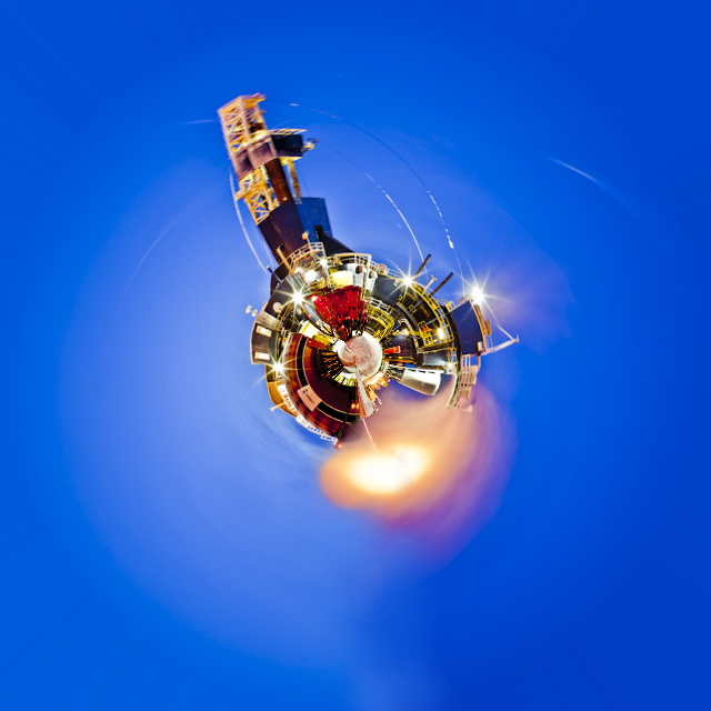
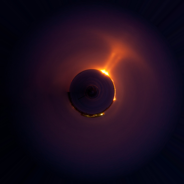
It seemed that during the California Photo Festival I could not swing a cable release without hitting a few people discussing or playing with the app called Tiny Planet. The app manipulates an image in a pretty cool way and the result often resembles a small planet in the center of a square frame.
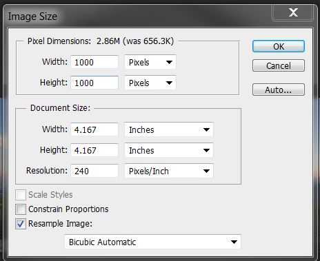
Although the buzz was about the phone app, the process has been around a while and there are many websites and blogs dedicated to the effect. So for all those who do not have the app or if you have it but want to apply a similar effect to your big photos, here is the quick way to do it in Photoshop.
Oh by the way, Jill Waterbury, Light's in house iPhoneography instructor, introduced just about everyone to the app and also requested the Photoshop method. So here it is for Jill and anyone else who wants to play around with their images to have fun and create.
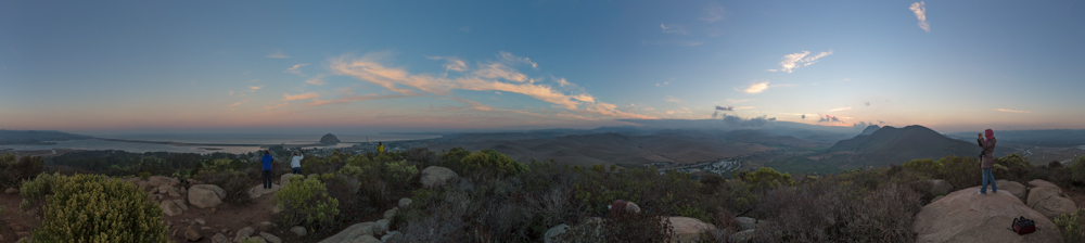
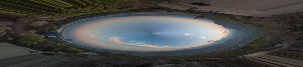
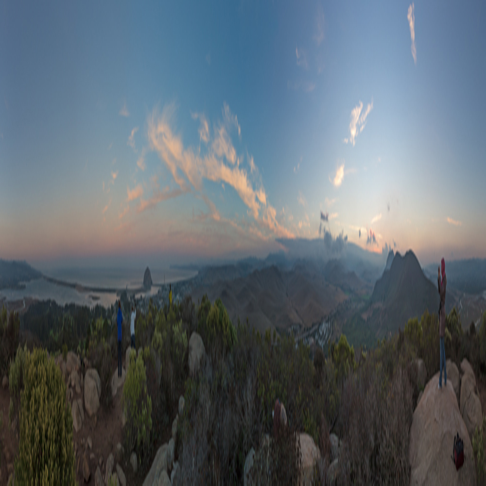
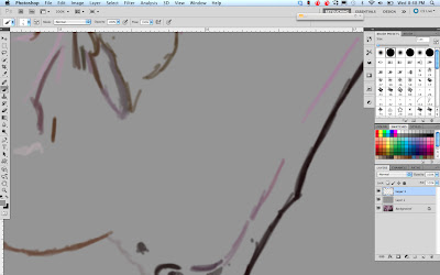
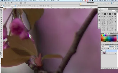
The Photoshop method works best on panoramic images, especially 360 degree panos, but can be done to any image. To demo the process, I will start with a 360 pano I shot during Click.