Lightroom 5 Beta Features - Hal's Favorites

The three part video demonstrates and discusses my favorite features of the Lightroom 5 beta.  The full feature list is below but my favorites are: Improved spot removal and retouching, the Radial Filter, improved crop overlay, import functionality, Smart Previews, and Upright for auto lens corrections.

In the video I reference additional keyboard shortcuts for the Spot Removal and Radial Filter tools.  The shortcuts are shown below.

Spot Removal (Q)

-New circle spot (auto-find source): Single click

-New circle spot (user-defined source): Ctrl drag

-New circle spot (scale from center): Ctrl Alt drag

-New circle spot (scale from anchor): Ctrl Shift drag

-Connect two circle spots: Single click + Shift click

-Increase circle spot size: ]

-Decrease circle spot size: [

-New brush spot: Click drag

-Constrain brush spot to straight line: Shift drag

-Cycle Spot Type: Shift + Q

-Auto-Find New Source: /

-Visualize Spots: A

-Hide Spot Overlays: H

-Delete spot: Alt select

-Delete selected spot: Delete

-Delete multiple spots: Alt drag select

Radial Filter (Shift + M)

-New elliptical mask: Drag

-Apply new mask to crop bounds: Ctrl double-click

-Expand existing mask to crop bounds: Ctrl double-click on mask

-Duplicate: Ctrl Alt drag

-Invert elliptical mask: ’ (apostrophe)

-Hide/show guide: H (short press)

-Hide guide on press, show on release: H (long press)

-Apply & dismiss: Double-click on photo

-Delete selected elliptical mask: Delete

Major feature list

-Smart Previews

-PNGs now supported in Lightroom

-New fullscreen mode.  F key is true full screen.  Legacy full screen mode is Shift + F

-Configurable grid overlays for Loupe view

-New searchable criteria for Smart Collections - File size, Image size, Image bit depth, color channels, Color mode, Color profile, Smart Preview statsus, and PNG

-Advanced healing brush for Spot Removal

-Radial Filter

-Upright auto lens corrections

-LAB color readout on histogram.  Right click on the histogram for a flyout menu.

-New book features

I will do additional videos to show some of these upgrade features.

Fiat Lux!

Guest Blog! 5 Food Photography Tips

by Kent Cameron

Food photography has never been more popular. The interest in food and sharing food experiences have been driven by digital cameras, food blogging, Facebook, Pinterest, e-books, cookbook self-publishing and media like Food Network, which have all helped to fuel the food trend.

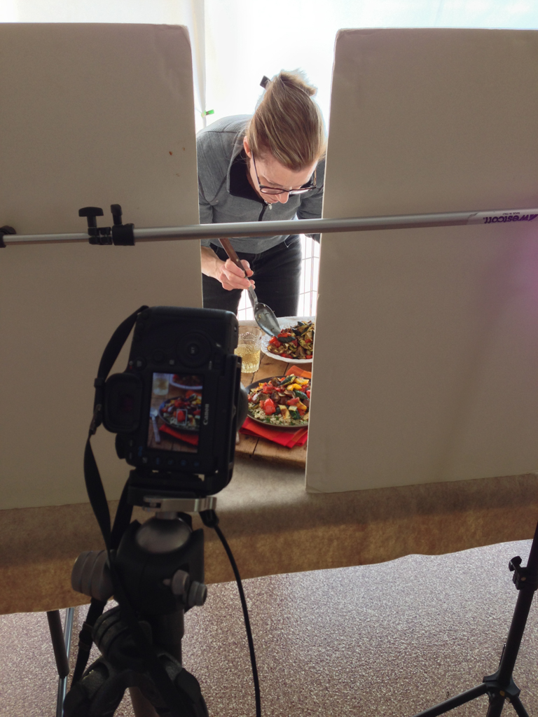
Following that trend, several years ago my wife, Sally, a professional chef, decided to create a food blog called, A Food Centric Life. She asked if I could use my photography skills to take some shots of her food. I quickly learned that creating great looking food images has its own special set of challenges.

Whether you are a photographer wanting to add food to your portfolio, a cookbook author, a blogger, or anyone interested in shooting food, here are a few tips from my food photography journey that may be helpful in your journey…

Tell a Story

When we prepare for a food shoot, we talk about the story first. The story may be about enjoying some crème brulee and espresso at a bistro in Paris, or grilling burgers in the park for a picnic on a rustic table, or something very simple.​

Ask yourself what the food or recipe means to you? Does it have meaning in your life? What is the setting? Is it a holiday, a seasonal dish, a fami­­­­ly favorite? What props, colors and textures are involved? How will you tell that story to the viewer with your image?

Direct the Light

Look for light that has direction. It can be light through a window, or doorway. We often shoot food in our garage with the open garage door creating a large space with directional light. Or, we create directional light using studio lights when natural light is not available.

Set up the shot so that the light is coming from behind or from the side. Think about light direction like the hands on a clock. If the food is at 6:00, backlight is 12:00, and side light is 9:00 or 3:00. Lighting this way creates depth and interest in the food. Never light food directly from the front, and absolutely do not shoot food with a flash mounted on your camera.

Diffuse and Reflect

A common mistake is to over light food images. Once you have created a scene with directional light, then can decide how much highlight and shadow works for the shot. Use a diffuser to soften the light and control highlights. Not all food images use soft light, but it works great for many.

Use a reflector to control the amount of shadow. We use pieces of basic foam core board that you can buy at any art supply stores as a reflector. Position the foam core opposite the light. Use white foam core to reflect light and brighten the shadows, and black foam core to take light away, creating deeper shadows. It's amazing what you can do with your food images by just experimenting with reflectors.

Work the Composition

Amazingly subtle changes in your composition can make or break your image, so really work your shot angles, direction of the light, placement of the food and props in the shot. Use the composition rule of thirds and avoid placing food dead center in the frame.

Style the Food

The job of a food stylist is to make the food look its best for the camera and create direction or flow of movement for the eye. Unless you are working a well budgeted food shoot, likely the food stylist is you! I am fortunate that my wife, Sally, is a chef so preparing and styling the food is her department. 

Buy top quality food and ingredients. You want beautiful food for beautiful food photos. When styling, think how you can create movement in the image. Add a flowing napkin with complementary color, for example, or maybe a utensil. Think about how you can add textures and create lines that draw the viewer's eye into the food scene.

Learn More about Food Photography

Kent and Sally Cameron work as a team, blending their love for great food, photography, and teaching to produce beautiful images that inspire and educate people about food.

Orange Ginger Creme Brulee.jpg
Turkey Burgers.jpg
Roasted Ratatouille.jpg

Rick Sammon: Color Efex Pro Tip

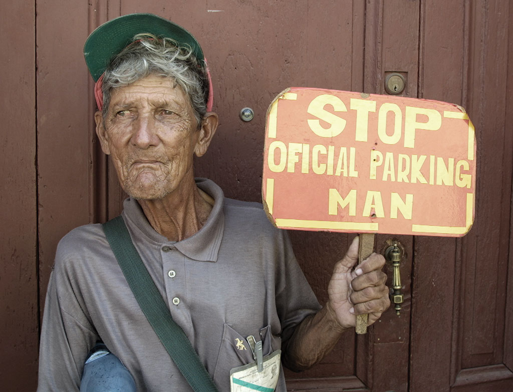
I photographed the “Official Parking Man” of Old Havana, Cuba. I like the straight shot, but I wanted to remove some of the reality from the scene, which is another advantage to using plug-ins. When we remove some of the reality from an image, our pictures can look more artistic and creative.

In Nik Software's Color Efex Pro
Filter: Bleach Bypass

Effect: Intensifies an image by creating a greater difference between highlights and shadows. Adds bold tones to an image.

Filter Tip: Experiment with Saturation settings. As with many effects, less is often best, as I found with this image. This effect works well with images that have fine lines.

Photo Tip: Keep in mind that people don’t always need to be looking directly into the camera when you take their portrait.

​And check out Rick's new iPhone/iPad app with 50+ tips on using Nik's Color Efex Pro.

Before

Before

After

After

Rick Sammon's New iPhone/iPad App!

​The amazing Mr. Sammon has just released a new app for the iPhone & iPad that is like an interactive eBook. If you wanted to know how to get the most out of Nik Software's Color Efex Pro, this app is for you. And it's an absolute STEAL at $0.99! Jump over to the app store today and check it out!

More info on the app on Rick's site HERE.
Buy in the App Store.​

Computer Specs

One of the most common questions we field concerns computer technical specifications.  People often ask how they should equip and configure their next machine for digital photography purposes (often phrased as Photoshop or Lightroom purposes.)  So let's talk computers for one little post.

Recent build in the LIGHT studio.

LIGHT recommends the current specs as an excellent configuration.  Off the side I will add comments and fall back positions.

Processor - Core i7 quad core.  We are currently using the Core i7 3770 at 3.4 GHz.  Although the two programs listed above perform best with a fast processor a good fall back position is found in the Core i5 3xxx options. We could go on a bit further regarding hyper threading or adding additional physical cores but we have not seen a huge requirement in typical digital photography needs.  If you push a bit beyond the ordinary with your work, take these into consideration.

Memory - 16 GB.  Most baseline systems these days are equipped with 8 GB of RAM but 16 will give you a nice performance boost.  There normally is no need to get the fastest clock speed RAM available unless you are also going to play games.  On the lower side, go with 12 and on the upper top out at 32.

Graphics - Dedicated video card.  There are a huge number of options here but start with an nVidia or ATI set with at least 1 GB.  You may be tempted to go with the higher end cards but you will not see a huge benefit unless you are working with video or gaming.  If you are thinking of running two or more high resolution displays you may want to upgrade as well. With all that said, the integrated graphics on the Core i5 and i7 (from 2500-4000) are pretty good.  You might be surprised how well they work.  The nice thing is you can always add a dedicated video card later if you need to.

SSD - Solid state drive for programs and speed critical data.  SSD prices have dropped significantly and the performance boost is really nice.  An SSD is not a must have but a majority of our clients enjoy the faster start up times and fast program launches.  At a minimum go with a 128ish GB drive.  You can go bigger (my laptop has a 512 GB SSD) but the drives will be a bit pricier.

Hard drives - At least two, one for data and one for scratch/working space.  Hard drive prices have come back down so we like at least 1 TB for storage and 320-500 GB for scratch.  Try for the 7200 rpm drives and if you want faster there are 10k and 15k rpm available. 

Ports - USB 3.0 and Thunderbolt.  Odds are you will connect external storage to your machine and you want it to be fast.  At the top of the list is the Thunderbolt connection, huge speed and flexibility but not as many peripheral/storage choices and much more expensive.  Not nearly as fast but almost ubiquitous and priced right, the USB 3.0 connection is a necessity. Definitely think about these options as one of the most frustrating things is waiting for your machine to communicate with external storage (Lightroom users especially.)

Fortunately, these specs are not too far out of reach for most folks.  Although you may pay a bit more for the system, configuring it properly will save you big in time and workflow efficiency.

Pure fun building this little beast of a Photoshop machine.

For the somewhat adventurous, LIGHT recommends building your own system.  I recently built the computer shown in the pictures above for about $1275 and two hours of my time.  It has all of the options listed above and is unbelievably fast.  For those who may be thinking Thunderbolt and Windows?  My machine is Windows and has two Thunderbolt ports along with eight USB 3.0 and a handful of USB 2.0.  Depending upon how and when you source your parts the do it yourself option can save you quite a bit.  More importantly, the process forces you to learn about the options and make smart choices as to what is best for your needs and workflow.

Any questions, comments, concerns, or addtions add a comment or email me at

hal@lightworkshops.com.

Fiat Lux!

Guest Blog! Flower Photos Beyond the Macro Lens

by Rob Sheppard

For Southern California where I live, spring is here and flowers are blooming. California as a whole has a very long spring compared to Minnesota where I grew up. Flowers can be found year round in many areas, plus a true spring in terms of flowers starts at the end of January and doesn’t end until June.

Flowers are such a great subject, too, because they are beautiful and they never run away from you or complain about having their picture taken! We are going to have a great field workshop to explore flower photography this April at LIGHT, and it will also include very practical work in Lightroom and critiques.

One of the first things many photographers think is that they must have a macro lens to do flower photography. While a macro lens can do many good things, it can also be very limiting for flowers because it is just one focal length.

I use focal lengths from 10mm fisheye to 400mm telephoto for flowers (I shoot APS-C format; for 35mm-full-frame, equivalent focal lengths would be 15mm fisheye to 600mm telephoto; for Four Thirds, this would be 8mm fisheye to 300mm telephoto). With the two California poppy photos seen here, I used a 10mm fisheye and a 200mm telephoto. With the yellow black-eye susan flowers, I used a 16mm wide-angle, and for the white thistle, a 400mm telephoto. I focus close in three ways: I look for lenses that focus close on their own, I use extension tubes, and I use achromatic close-up lenses.

Extension tubes are just that, empty tubes that extend the lens away from the camera body (you do want the kind that connect the camera electronics to the lens electronics, though). That allows any lens to focus closer. How close you can focus depends on the focal length to extension tube size. Wide-angle lenses need minimal extension to focus very close (usually you will find it difficult to use extension tubes for lenses wider than 24mm), while telephoto lenses need more. You can get a set of Kenko auto extension tubes for almost any camera brand, and I find they work well.

Achromatic close-up lenses are highly corrected close-up lenses that screw onto the front of your lens. Canon’s achromatic close-up lenses are best known – the 500D and 250D. I have a 77mm 500D that is big enough to be used with a wide-angle lens, plus I can use adapter rings to fit it to smaller diameter lenses.

Either extension tubes or achromatic close-up lenses can make all of your lenses act like macro lenses in terms of close-focusing. Results can be quite remarkable, though the quality can only be as good as the original lens. One thing you may find is that some lenses do well up close, and others do less well, and you cannot predict this by the price of the lens.

I love to use telephotos to isolate a flower and make it stand out against a soft, beautiful background. To do that, I will often shoot wide-open for f-stop – don’t be afraid of your wide f-stops such as f/2.8, f/4. f/5.6. Telephotos also compress distance and make a group of flowers tighter and more dense. They can also enlarge a portion of the background to make it work better behind your subject.

I love wide-angles for close-ups because now I can emphasize the environment of the flower. You now get in really close to the subject, and I mean REALLY close. Often I suggest photographers set their wide-angle to its closest focusing distance, with or without an achromatic close-up lens, and then move in until the flowers are in focus to really see the possibilities here. This forces you to get close.

A wide-angle up close makes the background smaller, yet more noticeable. It can be challenging to use because of that, but on the other hand, that is exactly what makes this type of shooting interesting. Depth of field is always greater so even out-of-focus areas are recognizable. Finally, perspective is stretched out so that flowers look like they are spread apart more. That can offer some very interesting opportunities for compositions that stretch back into the distance.

Come see Rob this spring and learn these techniques and more at his Springtime Flowers and Lightroom workshop April 24-28, 2013.​

Rob's free e-book, A Nature Photography Manifesto, is now available for the iPad or as a PDF e-book for any other computer. You can find the iPad interactive version at the iBooks Store. There are also links to both versions at www.robsheppardphoto.com/books.html.

California Photo Festival Photo Contest Winner!

Congratulations, Barbi Kutilek!

Out of the hundreds of awesome photos that came from our Third Annual California Photo Festival we narrowed down our top photos. From that selection we chose one deserving winner who has won a free Gold-Week Pass to our Fourth Annual Festival October 7-11, 2013.

​California Photo Festival Photography Contest Winner Barbi Kutilek www.Imagesbybk.com

​California Photo Festival Photography Contest Winner Barbi Kutilek www.Imagesbybk.com

Here is the gallery link to our TOP 50 California Photo Festival images from 2012 in our SmugMug sponsored Web Gallery. Thank you SmugMug for your continued support! Our past festival photo galleries there as well if you'd like to take a look while you're there!

About the California Photo Festival:​

Also known as CLICK! our annual California Photo Festival was launched in 2010. After years of prep and planning with inspiration from our guest instructors we invite to teach here at LIGHT Photographic Workshops throughout the years we were excited to offer our students and friends in the industry something new and unique.​ Beyond the 5 days of awesome photo-ops and now over 170+ sessions scheduled (in 2012) this is an event that is for those who have a passion for all things photography and enjoy the learning process to create good images. We design our schedule from sunrise to night photography with hands-on shooting sessions, digital workflow seminars and sponsored presentations. With a wide range of topics from landscape black and whites to Playboy style shooting and lighting techniques to horses on the beach at Morro Bay, we allow our attendees to sit in on sessions and classes they wouldn't normally find themselves taking a workshop or class on. It's a way for us to help you grow as a photographer, artist and professional grow and experience the best in the industry and have fun in the meantime!​

​Ric Sammon on his festival Photo Walk

​Ric Sammon on his festival Photo Walk

This year our dates are October 7-11, 2013. We will center the festival at Embassy Suites in San Luis Obispo but our venues include spectacular areas around the Central Coast. With such a wide area of SLO county land to chose from, we are growing and diversifying our venue list every year- while still keeping the classics around.​ We plan to launch our schedule and websiteregistrations Mid-April so keep a look out for the announcements and make sure you register early to get the classes that fill up quickly! Just wait until you see who we have coming this year!

See you in October!​

-The LIGHT Team

Break OUT!

Print Testing and Breaking Out of Your Normal Box
by Victoria Schmitt

A couple of weeks ago LIGHT hosted a printing class featuring Hal Schmitt which I was able to assist. One of my favorite things as an assistant is being able to help people with their images. With small tricks of the trade in Photoshop or just being able to help someone to think outside of their normal processing workflow will sometimes give people that “ah-ha!” moment to go forward with at home.

Here is how I helped our students once they thought their image was “print ready”.

1. Do one more dust spot check. I like to blow the image up to 100%. Choose the spot healing brush tool (yes, there are 20 ways to everything in Photoshop and this is just one of them) and with the hand tool (hold down the space bar) jiggle the image a little bit as you pan across the image on your screen. Some people like to use page and page down- which is fine, just make sure that you are still “jiggling” the image. It helps those inconsistencies jump out to your eye.

2. Pan out to view the entire image on your screen. Does anything jump out to your eye in a negative way? Is there a light or dark area that fights the direction of your eye when you look at the image? Sometimes I find that I need to print out a test print to really see what the image is doing to the “viewer’s eye”. I’ll sometimes look at the center of the image or the area where you want your focus brought to. If your peripheral vision in the image catches a shape, tonal change or area that pulls your focus away from where you want it then work on that toremove the shape” (usually a stick or object that could other wise just not exist), tone down your bright areas or crop out parts closer to the edge that keep the image from appearing complete.

3. Start with a small test print (8.5x11). This shows blatant areas that need attention, global tonal needs, and it also tests you to make sure your print settings are correct.

4. Print the next size up: I go with 13x19 paper size. This usually starts to show you more missed spots, more chromatic aberration color shifts and gives you a better idea of where they eye wants to move.

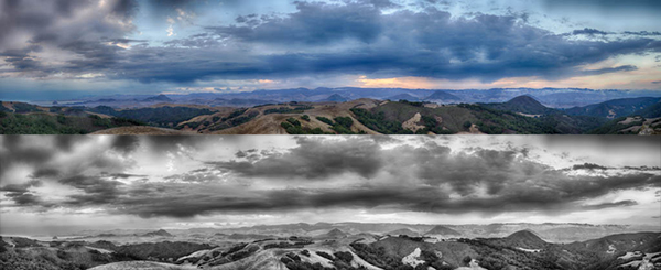
Something else you should consider about images that might just not feel right to you is trying the image in black and white. I had a student whose style screamed black and white and she had no idea until we tried it out. Her color versions didn’t have much of a pop or wow factor because my eye was trying to process the texture, movement, shape and color. Sometimes the best thing for your images is to simplify. Maybe you took that photo because you liked the texture, the lines, the movement and the subjectbut you start processing color as well and your brain can get confused and wants to move on. Working on those images can make you frustrated!

This is when I will sometimes give myself shooting or processing assignments to release my brain from the usual workflow and give it something new to concentrate on. Go back to the images you have already shot and decided not to process. Ask yourself “why didn’t I process that image?” and go to town with it! Change the hues, crop it down, try it in vertical and horizontal! Go to Lightroom and make a few virtual copies, create 5-6 different versions and see if there is anything about that image that you like. If those 5-6 new versions don’t do it for you- delete it and save your hard drive space!

There is no right or wrong answer when it comes to YOUR work. Experiment to see what you like and see what works and what doesn’t. The next time you go out to shoot, keep those lessons in mind so you know what you’re going to work on later. You will become a more efficient photographer when it matters and more fun when you process.

before_after.jpg

Add Two Steps

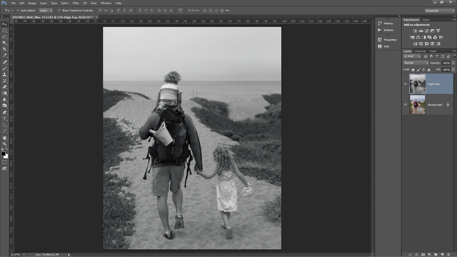
Recently, we have seen an increase in photographers using the High Pass filter in Photoshop to add edge contrast and texture detail to their images.  This is a cool technique but when you use the filter remember to add two more steps; desaturate your layer before applying the High Pass filter and always target your filter effects with a mask.

You may have seen or heard many photographers talking about how they sharpen only on the Lightness channel in L*A*B* or they make sure to change the blend mode of their sharpening layers to Luminosity or they use the Fade option with a Luminosity blend mode change.  There are many good reasons to make these switches and we suggest you use them in your sharpening or contrast boost workflow.  For the same reasons, when you use High Pass desaturate.

It is a common misconception that when you run the High Pass filter you are left with an image that is baseline 50% gray and only shows brighter or darker tonality at the edge contrast and texture detail.  Instead, High Pass may retain color information from the original image.  This can lead to color shifts or colored fringe along a high contrast edge similar to haloing.

Notice the

remaining color.

Our workflow is to copy the background layer or stamp visible if you have a multi-layer document and then desaturate via Image>Adjustments>Desaturate this can also be executed with the keyboard shortcut of CTRL+Shift+U for Windows or CMD+Shift+U for Mac.

For those who want to play or have more control you can

  • Run a Black and White adjustment instead and modify the tonality of the color arcs.
  • Use multiple layers of High Pass set to different radii.
  • Leave the color in your layer in order to generate a color boost. Watch out for fringing!
  • Use the filter on a Smart Object so you can make changes.
  • Invert your filter layer to decrease contrast and texture detail.

The second misconception is that areas that appear to be smooth after running the High Pass filter are not. Make sure to use a mask and target the filter effect to only those areas that you want to modify. In general, LIGHT does not recommend enhancing the edge contrast or texture detail on the following:

  • The sky especially blue sky.
  • Areas of constant color or tone.
  • Flowing water.
  • Out of focus areas.
  • Human skin especially female skin.

Fiat Lux!
Ben Willmore on CreativeLIVE

Ben Willmore, one of our favorite instructors is on CreativeLive today through Saturday. Stream it live for free or buy the (incredible and totally worth it!!!) videos for $99 by the time the course is finished airing. If you wait buy them they go up to $149. Still a great deal for what you get!

Or come join us in Los Osos and work with Ben in person for his Mastering HDR & Light Painting course in March.

Impromptu Flash Accessory for Holiday Family Portraits!

Packing for a Christmas or family holiday trip can be a bit hectic...sometimes you might even forget a modifier for your Speedlight.

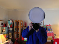
Hal scooting with his homemade modifier.

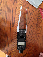
Now what you are about to see is what we like to call "bush league" but the modifier/soft box works extremely well and you can definitely find the materials at grandma's house! Depending on the size of your flash you can also create any size you want.

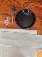
For a very simple modifier here are the items you will need:

  • 2 plastic or paper plates (you can choose dinner plate size or a dessert platter depending upon the size of your flash and the "softening" power you want)
  • Gift box tissue paper (white is most most versatile but a colored tissue will be just like a colored gel)
  • Tape 
  • Scissors

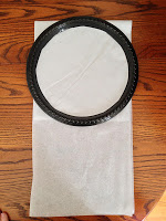
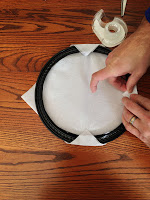
All of the pictures below show the entire process. Start by cutting out the inside or flat portion of the plate. Try to keep as much of the cut out portion because you will use it later in the process. The ring you are left with is the frame for the modifier.

Cut or fold the tissue paper into a square about the same size as the frame/ring.  One piece will do just fine but if you want to make the light more even, add an additional layer or two.  It is always a trade-off though when you add layers.  The light becomes more even but you will lose more of the flash's effective power.  For example, when I made this example, I used four layers of tissue and lost approximately 2.5 stops of light.

Tape the tissue to the frame.  You can get all "gucci" with it but I used four pieces and have a nice, tight surface.

From the cutout portion of the plate, fashion a rectangle or two.  Put onto the end of your flash to act as an attachment collar.

With the other plate cut out two rectangular supports.  Tape one end of each to the attachment collar on the flash.  The final step is to tape the supports to the plate/modifier.  When you put the flash on your camera, I like to change the zoom to Manual at about 50mm.

Simple but effective.  When we talk about light's quality of being either hard or soft, the only factor that matters is the size of the light source relative to your subject (this is, of course, controlled by the size of the light source and the distance from the source to the subject.)  The bare surface area of the flash is @ 3.7 square inches.  After adding the "bush league" modifier the surface area is @64 square inches. That is an increase of 17X.  One of the biggest issues with many modifiers is they do not really change the surface area by that much. But 17X?  That is effective!

Another nice feature of this homemade version is it is extremely light.  Whenever you add an attachment to your flash, always consider weight.  If the modifier is too heavy or has a lengthy moment arm you can easily damage your flash.

Alaska Time Lapse

While I was looking over some images for yesterday's blog I found this sequence.  Thought it would make a nice simple time lapse.

Gorgeous Alaska day and a slow humpback whale dive.  Shot the sequence on my photo tour with a Canon 1D Mk IV and an EF 70-300 4.5/5.6L.

Put the time lapse together with Lightroom. Recommend the 720 quality option.