Humpback Bubble Net Feeding Lunge

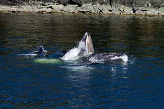
The Flash sequence above shows the end game of the humpback whale bubble net feeding lunge.  These huge animals have developed a technique to corral their prey into a tight ball to make eating a bit easier; not a bad plan when you have to eat so much.

Either singly or in groups the whales dive and coordinate releasing air to create a curtain of bubbles around, in this case, tens of thousands of herring.  The whales slowly come together in a decreasing spiral to concentrate the bubble curtain and the fish.  The survival instinct of the fish kicks in and they form tighter and tighter balls driven towards the surface by the bubbles and the whales themselves.

​Mouth open @90 degrees!

Mouth open @90 degrees!

Nearing the surface the whales propel themselves aggessively upward and lunge out of the water with gaping jaws open almost 90 degrees.  As is seen in the detail shot herring are leaping out of the water to get away. 

​Click on the detail shot above to see flying herring.

Click on the detail shot above to see flying herring.

Interestingly, bubble net feeding is not seen in all humpback populations around the world.  We were fortunate to observe bubble net feeding although we typically saw only two or three whales at a time.  This was not because of lack of food, there were billions of herring in the water for the annual spawn.  Rather it was a lack of whales.  In late April and early May, the Alaskan humpback numbers are fairly small as most whales are still making the swim from their winter grounds around the Hawaiian islands. 

When we go back in July, we expect to witness bubble net feeding with groups of 15+ whales.  Almost makes me embarrassed to show a sequence with only two.  I will re-engage in July with more whales!

The trick to photographing the lunge is twofold.  First, expect there will be a large splash and significant whitewater.  These will be your highlights and will drive the exposure.  Metering off dark water without any concern for the splash/bubbles will yield blown highlights.  I prefer to shoot in Manual mode with an exposure to properly expose white.  Second, watch the whales and learn.  You will see patterns in the water immediately before the whales surface.  When the patterns show up, point your camera with exposure set for the highlights, focus, and shoot!

Fiat Lux!

Embrace the Group

As many of you know the power of Photoshop is found in the layer.  Taking that a little further, it is found in the combination of many layers to achieve just the look or design you are going for. 

Some users are hesitant at first but soon find themselves adding layer after layer in order to perfect an image.  As I walk around the classroom looking at people's work it is not unusual to find images with 25+ layers! 

With all those layers, things can get a little bit confused and cluttered.  We recommend two simple tips to help keep everything logical and organized.

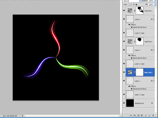
A mess of layers.

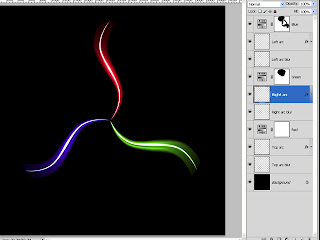
1) Name every layer.  Of course, Photoshop does this for us but the auto generated layer names do not always tell us exactly what the layer is doing.  Try to name each layer with something simple that tells you immediately what the layer does for your image.  The simpler and more meaningful the better as you might revisit the image a day, a month, or a year in the future and will want to know quickly what each layer does. To rename a layer just double click on the current layer name and an editable text box will pop up.  If you happen to click in the wrong spot and the Layer Styles dialog opens, no worries.  Just close it and try again.

Layers with meaningul names but still cluttered.

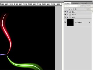
2) Use groups!  Groups are like parent folders on your hard drive.  A parent folder may contain dozens of files.  When you want to see them all you expand the folder, when you don't collapse.  A group works the exact same way.)  When the layers start piling up see if there is a way to group them together.  For example, if you have five layers to optimize the sky put them into a group.  To create a group, highlight the layer or layers you want together and then position your mouse over any of the layer thumbnails.  Click, hold, and drag to the Group icon at the bottom of the Layers panel.  The group icon is the one that looks like a small folder.  It is the third from the right directly next to the create new layer icon.  Once you have a group remember to give it a meaningful name.  You can easily expand or collapse the group by clicking on the small triangle to the left of the group thumbnail (a folder icon.)

With properly named groups it is much more logical and organized.

You can have as many groups as you need or want.  Once you have a group you can also add  a layer mask to selectively reveal or conceal the effects of the entire group.

Try these two techniques and see if they help manage the possible confusion and clutter that comes with a multi layered document.

Fiat Lux!

When Boring Photos Attack!

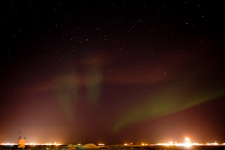
A boring, uninteresting aurora shot.  Destined for the Recycle Bin.|
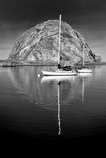
Just because it is a big stitched pano, does not make it interesting.

I am sure it would never happen to our readers here but every now and again I run across the dreaded "Boring Photos of Interesting Things" phenomenon. 

The more I think about it, it probably happens to everyone at some time in their photographic journey.  You have perhaps traveled around the world to an exotic location or maybe just stepped outside your front door to an amazing scene.  During the capture process, it seemed like everything went right.  We had the equipment, we knew the technique, and had a great subject in front of the lens.  After the fact looking at the images in Lightroom or Photoshop, something just is not right. 

When this happens there are a couple of great takeaways or lessons to be learned.  First and most important, go back to the basics and fundamentals of what makes a great image.  Where does the pop, the impact, or the wow factor really come from.  Strong composition and exposure will always start you off on the right track.  Ask yourself if you took the shot or if you made an image.

Second, try to remove yourself from the experience itself and concentrate on just the image.   Examine your effort with a critical eye and look at the image from a detached observer perspective.  We often have an emotional connection to our shots that do not allow this type of examination.  Pull back and view the image as if you were not the one who shot it.  Would you still be interested? 

Third, if possible, get rid of the image or at least bury it.  I understand that sometimes these images are all we have to remind us of a particular event, trip, or experience.  If I do not have a better capture, I will keep some of these around as mementos.  Most of the time, I just let them go.  I will learn from the experience and next time I will make an image.  

Off to the trash.

Here I have attached two recent unbelievably boring pictures of a really cool thing.  Like so many others I've shot, here are two bad aurora images.  It was great to experience but the images, for lack of a better word, suck.  As described above, I went back to the basics; both of these images have no real subject, no anchor, no foreground element, no real composition, no flow.  From a detached observer perspective, they are not interesting.

So these two shots make their debut and finale all at the same time. You'll find these images here and in my Recycle Bin for another few minutes before they go bye-bye.

Fiat Lux!

Tip of the Week: Using Color Lables in Adobe Lightroom and Bridge

One of the most overlooked features in Lightroom and Bridge is the Color Label. Both programs offer five colors (red, yellow, green, blue, and purple) to assist you in managing and organizing your images. These colors may be assigned a specific meaning in your workflow and when assigned to an image you will have a quick visual reference to your image "types."

To assign a Color Label in Lightroom, highlight an image or images, position the cursor over the image, and right click. From the flyout menu select "Set Color Label" and choose one of the colors. You may also use the keyboard shortcuts of 6 (Red,) 7 (Yellow,) 8 (Green,) or 9 (Blue.) Unfortunately, no keyboard shortcut for purple. In the Bridge, select just as above and then right click. At the bottom of the flyout menu choose "Label" and pick the appropriate option. You will notice there are no color names but instead text assigned to a color. To customize, go to Edit-Preferences (Win) or Bridge-Preferences (Mac) and select "Labels" from the menu. First uncheck the box at top to enable single stroke keyboard shortcuts the same as above then enter a meaningful description for each color.

You can use the Color Label anyway you prefer; as an example here is my system. Red = High Priority Yellow = Web Green = HDR Blue = Stitched Pano Purple = Expanded DOF

Join our newsletter to get more tips from the crew here at Light!

Fiat Lux!
Geotagging Safety - A Few Things to Think About

As many of you know we at Light strive to educate our clients as much as possible so they can make the best choices with their photography, gear, software, workflow, etc. In the same spirit, I attached a relatively recent Army training presentation concerning Geotagging safety.

There are some amazing advances in technology these days and they have been applied fairly aggressively with social networking and sharing applications. Cool stuff but sometimes there are some things going on behind the scenes that you may or may not want.

The discussion below is from an operational, military perspective but it applies to most folks. I have shown it to a few people so far and most made some immediate changes to their phones, cameras, and more.  Not trying to make anyone paranoid but good information.

Feel free to shoot me an email at Hal@LIGHTWorkshops.com if you have any questions, comments, concerns, or feedback.

GeotaggingSafety Army


Fiat Lux!